Use Python in Power BI : A Comprehensive Tutorial For Data Analytics and Data Science
- IOTA ACADEMY
- Mar 13, 2024
- 10 min read
Updated: Mar 20, 2024
In the ever-evolving landscape of data analytics and visualization, Power BI has emerged as a go-to tool for professionals seeking insightful and interactive reports. While Power BI offers a myriad of features for data manipulation and visualization, integrating Python opens up a whole new realm of possibilities. In this tutorial, we'll delve into why Python is a valuable addition to Power BI and explore how to leverage its capabilities for data extraction, cleaning, and visualization.
Why Use Python in Power BI?
Python, renowned for its versatility and extensive libraries, seamlessly complements Power BI's native functionalities. Here are some compelling reasons to integrate Python into your Power BI workflow:
Enhanced Data Connectivity: Python expands Power BI's data connectivity options, allowing you to access a wider range of data sources and formats.
Advanced Data Manipulation: With Python's robust libraries such as Pandas and NumPy, you can perform complex data cleaning, transformation, and analysis tasks more efficiently.
Customized Visualizations: Python's visualization libraries like Matplotlib and Seaborn empower you to create highly customized and interactive visualizations that may not be achievable with Power BI's built-in tools alone.
Machine Learning Integration: Python's extensive support for machine learning enables you to incorporate predictive analytics and advanced statistical modeling into your Power BI reports.
Before Using Python in Power BI :-
Prerequisites:
Before diving into harnessing Python's capabilities in Power BI, ensure you have the following prerequisites in place:
Power BI Desktop: A little familiarity with Power BI Desktop Environment including Power Query Editor. You can Download and install the latest version of Power BI Desktop, which is essential for authoring and designing Power BI reports. You can download it for free from the official Power BI website (https://www.microsoft.com/en-us/download/details.aspx?id=58494) or it'll be better if you download from Microsoft Store (https://apps.microsoft.com/detail/9ntxr16hnw1t?hl=en-us&gl=US).
Python Installation: Install Python on your system if you haven't already. You can download. Use Anaconda, a comprehensive Python distribution that includes popular libraries and tools for data science, such as Pandas, NumPy, Matplotlib, and Jupyter Notebook. Anaconda simplifies package management and provides an environment conducive to data analysis and visualization. You can download Anaconda from the official Anaconda website (https://www.anaconda.com/products/distribution) and follow the installation instructions provided.
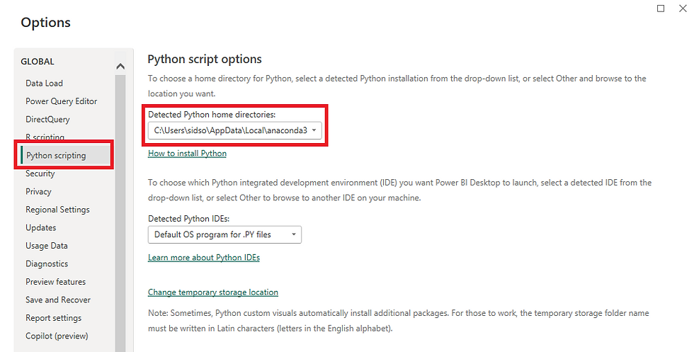
Python Integration Feature: Enable the Python integration feature in Power BI Desktop. You can do this by navigating to 'File' > 'Options and settings' > 'Options' > 'Python Scripting' and locating Python Installation Path using the option 'Detected Python home directories'.
Basic Python Knowledge: Familiarize yourself with fundamental understanding of Python programming language concepts such as variables, data types, loops, and functions will greatly aid in effectively utilizing Python within Power BI.
Python Libraries: Familiarize yourself with essential Python libraries such as Pandas, NumPy, Matplotlib, and Seaborn, as these will be instrumental in performing data manipulation and visualization tasks within Power BI.
Activating Python Environment: Activate the Anaconda environment for Power BI using the Anaconda Prompt. Use the WIndows Key -> Search for Anaconda Prompt -> Open the Anaconda Prompt and use the following command:
How to Use Python in Power BI?
For Getting Data:
To leverage Python for data extraction in Power BI, follow these steps:
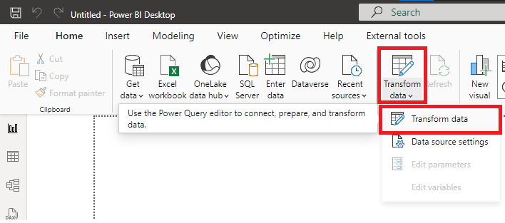
Step 1: Open Power Query Editor
Step 2: In the Ribbon click on New Source -> More -> Search for Python -> Select Python script -> Connect
Step 3: In this example I'm using the Python script utilizes the 'pandas_datareader' and 'yfinance' libraries to fetch historical stock market data from Yahoo Finance within a specific date range.
(You can install the libraries in Anaconda Prompt using pip install pandas-datareader, yfinance)
Now write the python script in the Python Editor in Power Query Editor & click OK: from pandas_datareader import data as pdr
import yfinance as yf
from datetime import datetime
yf.pdr_override()
y_symbols = ['SCHAND.NS', 'TATAPOWER.NS', 'ITC.NS']
startdate = datetime(2019,1,1)
enddate = datetime.today()
data = pdr.get_data_yahoo(y_symbols, start=startdate, end=enddate)
data=data.reset_index()
Let's break down the script step by step: Importing Libraries:
from pandas_datareader import data as pdr
import yfinance as yf
from datetime import datetime
pandas_datareader: This library allows us to extract data from various online sources, including Yahoo Finance.
yfinance: This is a Python library to fetch data from Yahoo Finance. It's used alongside pandas_datareader to access Yahoo Finance's API.
datetime: This library provides classes for manipulating dates and times.
Setting Up Yahoo Finance:
yf.pdr_override()
This line of code overrides the default data retrieval method of pandas_datareader with the one provided by yfinance. This is necessary because Yahoo Finance recently updated its API, and yfinance provides a more robust and stable method for accessing Yahoo Finance data.
Defining Stock Symbols and Date Range:
y_symbols = ['SCHAND.NS', 'TATAPOWER.NS', 'ITC.NS']
startdate = datetime(2019, 1, 1)
enddate = datetime.today()
y_symbols: This is a list containing the stock symbols for which we want to retrieve data. Each symbol represents a particular company's stock. The .NS extension denotes that these stocks are traded on the National Stock Exchange (NSE) of India.
startdate: This is the start date from which we want to fetch historical data. In this case, it's set to January 1, 2019.
enddate: This is the end date up to which we want to fetch historical data. Here, it's set to the current date using datetime.today().
Fetching Data from Yahoo Finance:
data = pdr.get_data_yahoo(y_symbols, start=startdate, end=enddate)
This line of code uses the pdr.get_data_yahoo() function to fetch historical market data for the specified symbols (y_symbols) from Yahoo Finance. It retrieves data for the specified date range (startdate to enddate). The retrieved data is stored in a DataFrame called data.
Resetting Index:
data = data.reset_index()
After fetching the data, it's common to reset the index of the DataFrame. This line resets the index of the data DataFrame, making the index sequential integers starting from 0.
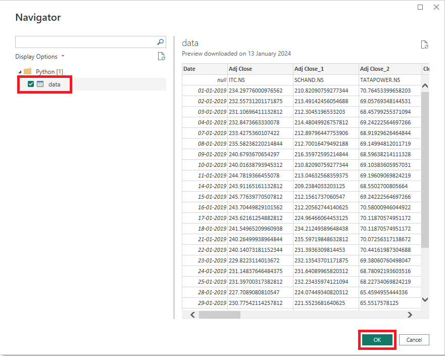
Step 4: In the Navigator check Mark on data & then click OK.
You'll see the data in the Power Query Editor:
Did you notice that our data has another headers in the first row? How to do we clean such data? Let's see in the next section.
Cleaning Data:
Python offers powerful tools for data cleaning and preparation in Power BI:
Utilize Pandas for tasks such as handling missing values, standardizing data formats, and performing data transformations.
Write Python scripts within Power BI to execute custom data cleaning operations tailored to your specific requirements.
Combine the power of data cleaning options available in Power Query Editor and Python
In the previous section we saw that our data has another headers in the first row:
Approach:
We can clean the data such that we can combine the Headers with the First Row of the Data. For example we can concatenate Adj Close with ITC.NS so that it'll look like this: Adj Close | ITC.NS
So as you can see all of the columns are in String Data Type except Date column and we have to conactenate Strings so we should change the Date column's data type to Text:
Now let's explore if there's a possiblity to concatenate Headers with First Row. We can see there's an option in Home tab in the Ribbon to Use First First Row As Headers. But we don't want to lose the existing headers. So there are two ways to perform the concatenation, first is to use the M Language and the other using the simplicity of Python. Let's perform the conacatenation using Python to clean the data. To do so click on the Py option located in the Transform tab in the ribbon.
Now in the Run Python script editor we'll clean the data:
As you can see in the editor that # 'dataset' holds the input data for this script. Which means we can acess the data using dataset keyword.
We'll apply the following algorithm to clean the data:
First we will import the pandas library.
Second we'll convert the dataset to pandas DataFrame.
Then we'll concatenate the columns with the first row.
Write the following code in the editor and click OK: import pandas as pd
df = pd.DataFrame(dataset)
df.columns = df.columns+" | "+df.iloc[0, :]
Code explaination: Importing the pandas Library:
import pandas as pd
This line imports the pandas library and aliases it as pd, which is a common convention.
Creating a DataFrame:
df = pd.DataFrame(dataset)
This line creates a DataFrame named df using the pd.DataFrame() constructor. It initializes the DataFrame with the data from the dataset variable. The dataset variable is assumed to be a list, dictionary, or another DataFrame containing the data.
Manipulating Column Names:
df.columns = df.columns+" | "+df.iloc[0, :]
This line modifies the column names of the DataFrame df. Let's break down the expression used:
df.columns: This refers to the existing column names of the DataFrame df.
df.iloc[0, :]: This selects the first row (0) and all columns (:) of the DataFrame df.
df.columns + " | " + df.iloc[0, :]: This concatenates each column name with the corresponding value from the first row, separated by " | ". The result is a new list of modified column names.
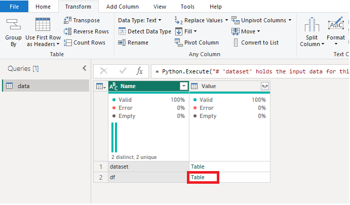
Now click OK and then select the Table option corrosponding to the df row:
Now we can see that the headers are concatenated with the first row. But the dates column header is empty:
That's because in Python, when you concatenate a string with a null value, it results in an empty string. This is because Python treats null values as empty strings. Now we'll double click on the empty header and rename it to Dates:
Now we can see the the first row of our data is not required. We can delete it by clicking on the Table icon nearby our first column. Then select the Remove Top Rows Option:
Now type 1 in the Number of Rows option and select OK:
As for the last step of cleaning, we can see that all the columns are in String data type except Dates columns. So we now convert these columns to floats by selecting all the columns except Dates by clicking on the second column then using Shift+Right Arrow (->). Now right-click on the headers and then choose the Change Type option and choose Decimal Number:
So now our data is cleaned it should look like this:
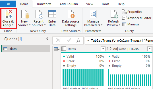
Now click on Close & Apply:
Remember all the steps will be applied automatically when the data is refreshed so no need to worry about the cleaning.
In the next section we'll visualize the data using Python.
Visualizing Data:
Python's visualization libraries enable you to create compelling visuals in Power BI:
Generate customized charts, graphs, and interactive dashboards using Matplotlib, Seaborn, or Plotly.
Integrate Python visuals seamlessly into your Power BI reports to enhance data storytelling and convey insights effectively.
In this example we'll plot a Kernel Density Estimation (KDE) plot on the 'Close_4 | TATAPOWER.NS' column that'll provide several insights into the distribution of the stock's closing prices. Here are some insights you can gain from the KDE plot:
Distribution Shape: The KDE plot will reveal the shape of the distribution of closing prices for TATAPOWER.NS stock. It might indicate whether the distribution is symmetric or skewed, providing insights into the overall behavior of the stock prices.
Central Tendency: The peak of the KDE plot represents the mode or the most common closing price. This can give an idea of the central tendency of the closing prices and help in understanding where the prices tend to cluster most frequently.
Spread and Variability: The spread of the KDE plot indicates the variability or dispersion of the closing prices. A wider spread suggests higher variability in the prices, while a narrower spread indicates more consistency.
Outliers: KDE plots can also reveal the presence of outliers in the closing price distribution. Outliers may indicate significant price movements or anomalies in the data that could be of interest for further investigation.
Trends and Patterns: By observing the KDE plot over different time periods, you may identify trends or patterns in the distribution of closing prices. This can be valuable for understanding the stock's price behavior over time.
There are two ways to plot KDE plot, one is to use Get More Visuals and import the visual from marketplace for which you'll require Power BI Premium License for which you have to pay or you can use Python visual to do the same for free.
To use the Python visual you can click on the Py visual option available on the Visualization Pane:
If it ask for enabling the python scripts then click on Enable.
Now in the Data Pane we'll select the column Close_4 | TATAPOWER.NS:
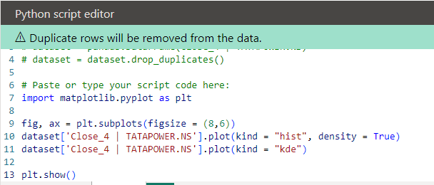
As you can see in the Python script editor, there's some predefined code is written where the column has been converted to pandas DataFrame and the duplicates have been dropped.
For visulaization we'll use the library matplotlib and we'll plot the KDE plot on the Close_4 | TATAPOWER.NS column:
import matplotlib.pyplot as plt
fig, ax = plt.subplots(figsize = (8,6))
dataset['Close_4 | TATAPOWER.NS'].plot(kind = "hist", density = True)
dataset['Close_4 | TATAPOWER.NS'].plot(kind = "kde")
plt.show()
Paste the above code below the line '# Paste or type your script code here:' in the Python script editor:
Code Explaination:
Importing Matplotlib Library:
import matplotlib.pyplot as plt
This line imports the matplotlib.pyplot module and aliases it as plt, which is a common convention.
Creating Subplots:
fig, ax = plt.subplots(figsize=(8, 6))
This line creates a figure (fig) and a set of subplots (ax). It specifies the size of the figure as (8, 6), meaning the width is 8 units and the height is 6 units.
Plotting the Histogram:
dataset['Close_4 | TATAPOWER.NS'].plot(kind="hist", density=True)
This line plots a histogram for the 'Close_4 | TATAPOWER.NS' column of the dataset. The kind="hist" parameter specifies that a histogram should be plotted. The density=True parameter normalizes the histogram such that the area under the histogram equals 1, effectively converting it into a probability density function.
Plotting the KDE:
dataset['Close_4 | TATAPOWER.NS'].plot(kind="kde")
This line plots a KDE plot for the 'Close_4 | TATAPOWER.NS' column of the dataset. The kind="kde" parameter specifies that a KDE plot should be plotted.
Displaying the Plot:
plt.show()
This line displays the plot with the histogram and KDE overlaid on it.
Overall, this script generates and displays both a histogram and a KDE plot for the 'Close_4 | TATAPOWER.NS' column of the dataset, allowing for visual examination of the distribution of closing prices for the TATAPOWER.NS stock.
Now this will give us the final output:
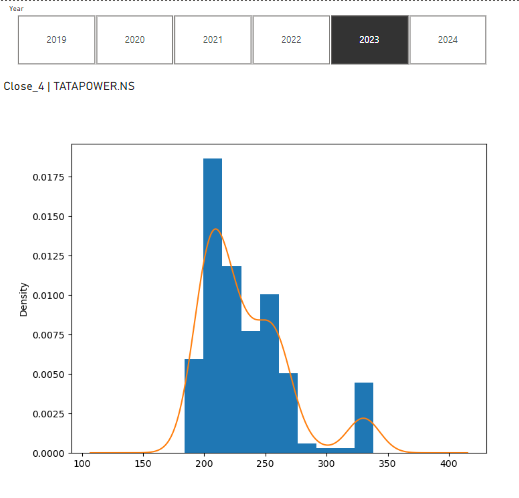
You can also use slicer to see KDE for different years. In the image below, I have used Year slicer to see the KDE plot for the year 2023 and it'll interactively change the python script and plot the graph accordingly:
Conclusion:
In this blog we have created an ETL (Extract, Transform & Load) pipeline using Power BI and Python where we wrote Python Script to Extract the data then used Power Query and Python to Transform the data and then Load the data to Power BI Desktop. Next we analyzed and visualized the data using Python. Python's integration with Power BI offers a powerful combination of data manipulation, analysis, and visualization capabilities. By incorporating Python into your Power BI workflow, you can access a broader range of data sources, perform advanced data cleaning and transformation tasks, and create highly customized and interactive visualizations. Whether you're a data analyst, business analyst, business intelligence developer, data engineer, AI & ML engineer or a data scientist, mastering Python in Power BI opens up a world of opportunities to elevate your analytics and drive better business outcomes. Embrace the fusion of Python and Power BI, and unleash the full potential of your data-driven endeavors.













Comments