

Most used Excel charts and when to use them
- IOTA ACADEMY
- Mar 13
- 5 min read
Updated: Apr 3
Excel charts are a vital tool for transforming unstructured data into insightful visual representations. They facilitate effective information communication, category comparison, and trend analysis. Nonetheless, selecting the appropriate chart type is essential for effectively displaying data. The most popular Excel charts, their functions, and when to utilize them will all be covered in this article.
Column Chart
One of Excel's most popular chart types is the column chart. Vertical bars are used to display the data; each bar represents a category, and the height of the bar indicates the value of that category.
When time intervals are equal (months, quarters, years), column charts are helpful for comparing data across many categories and showing trends over time. They are therefore perfect for financial comparisons, survey results, and sales success.
Learn more about How to Create a Column Chart in Excel
A column chart, for instance, might give a clear visual depiction of which region is performing the best and which requires improvement if a business want to compare its sales performance across five distinct regions.

Bar Chart
Similar to a column chart, a bar chart utilizes horizontal bars in place of vertical ones. Because it gives labels more room, this kind of chart is helpful when working with lengthy category names.
When there are too many categories for a column chart or when the category names are lengthy, bar charts work best for rating and comparing several objects. Surveys, financial comparisons, and corporate performance reports frequently employ them.
Explore step-by-step instructions on Creating a Bar Chart in Excel
A bar chart, for example, can effectively display the popularity rating of several social media sites when survey respondents are asked about their preferred platform.

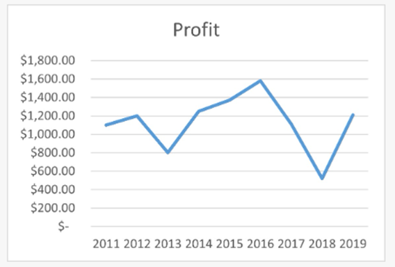
Line Chart
A line chart is perfect for illustrating patterns over time since it shows data points connected by a line. A line chart highlights patterns and changes in the data, as opposed to bar and column charts, which highlight individual data points. Trends, growth patterns, and future value predictions are all frequently accomplished with line charts. They are very helpful for analyzing internet traffic, stock prices, temperature fluctuations, and financial data.
Discover more about How to Use Line Charts in Excel
For instance, a company can forecast future sales by using a line chart to examine sales trends over the previous five years.
Pie Chart
A Pie Chart is a circular chart divided into slices, where each slice represents a portion of the whole. The size of each slice is proportional to the percentage it represents.
Pie charts are best used when you want to show the distribution of a whole into different parts. They work well for data that adds up to 100%, such as market share, budget allocation, and customer demographics.
For instance, if a company wants to illustrate how its annual budget is distributed across different departments (e.g., marketing, operations, salaries), a pie chart provides an easy-to-understand breakdown.
Check out How to Make a Pie Chart in Excel
Tip: Avoid using pie charts when there are too many categories, as this can make it difficult to compare slices accurately.

Doughnut Chart
With a hole in the middle, a doughnut chart resembles a pie chart. This makes it possible to display extra data inside the chart, like category labels or a total value.
While highlighting proportions, doughnut charts are helpful for comparing several data series. They are frequently utilized in marketing analysis, consumer segmentation, and financial reports.
A doughnut chart, for instance, can be used by a company to illustrate how revenue is distributed among several product categories and to show the overall revenue in the middle.
Learn the difference between pie and doughnut charts: Doughnut Chart Guide

Scatter Plot
Relationships between two numerical variables are shown using a scatter plot. Individual data points are plotted on an X-Y axis to create it.
When examining correlations, seeing patterns, and locating anomalies in data, scatter plots are helpful. They are frequently employed in machine learning applications, financial analysis, and scientific research.
Find out how to create a Scatter Plot in Excel
A marketing team, for instance, can examine the connection between advertising expenditures and sales revenue using a scatter plot. An upward trend in the points suggests that higher spending results in higher sales.

Area Chart
Similar to a line chart, an area chart highlights the magnitude of values by filling the space beneath the line with color. Area charts are helpful for comparing different datasets and displaying cumulative patterns over time. They are frequently employed in environmental data, population studies, and financial analysis.
Learn more about Creating Area Charts in Excel
For example, a business can present profit margins as a second statistic alongside revenue growth over time using an area chart.

Combo Chart
A combo chart is a combination of two or more chart types, typically a line chart and a column chart. This facilitates the comparison of two distinct data series with disparate scales.
Step-by-step guide to Combo Charts in Excel
When comparing trends and absolute values in a single chart, combo charts come in handy. They are frequently utilized in company analysis, financial reports, and performance monitoring.
To illustrate the relationship between profitability and revenue, a company can utilize a combination chart to display monthly sales as columns and profit margins as a line.

Waterfall Chart
When displaying the cumulative effect of both positive and negative data, as in financial accounts or profit analysis, a waterfall chart is utilized.
For displaying gradual variations in values over time, such as income vs expenses, profit and loss, or stock market fluctuations, waterfall charts are perfect.
Master the Waterfall Chart in Excel
A waterfall chart, for instance, can be used to show how revenue is modified after taxes, expenses, and other costs are subtracted to determine net profit.

Histogram
One kind of bar chart that displays a dataset's frequency distribution is called a histogram. It shows the frequency with which data points fall inside each range after grouping the data into bins, or intervals.
Histograms work best when examining outliers, variances, and data distributions. They are frequently employed in performance analysis, quality assurance, and statistics.
Learn how to create a Histogram in Excel
A histogram, for instance, can be used by a school to examine the distribution of test results and determine the most typical score range.

Box and Whisker Chart
The distribution of a dataset, including the median, quartiles, and outliers, can be seen using a box and whisker chart.
Box plots can be used to compare different datasets to find abnormalities, skewness, and variances in the data. They are frequently employed in research, healthcare, and finance.
Check out the Box and Whisker Chart Guide
A box plot, for instance, can be used by an organization to compare pay distributions among several departments and spot compensation anomalies.

Funnel Chart
A process's phases and the drop-off rates between them are shown in a funnel chart.
The ideal applications for funnel charts include recruitment procedures, conversion rates, and sales funnels. They aid in pinpointing the locations of the biggest drop-offs.
Understand How to Use Funnel Charts
A funnel chart, for instance, can be used by an e-commerce company to monitor the proportion of website visitors who progress to the checkout and finish their purchase.

Conclusion
Data can be made simpler to comprehend, analyse, and act upon by using the appropriate Excel graphic. Choosing the right chart type relies on your data and the narrative you wish to convey. Each form of chart has a distinct function.
Want to become an expert in Excel data visualization? Learn how to make data-driven decisions, automate reports, and produce effective charts by enrolling in IOTA Academy's Advanced Excel Course now. Enroll right away to advance your Excel proficiency!
Comentarios